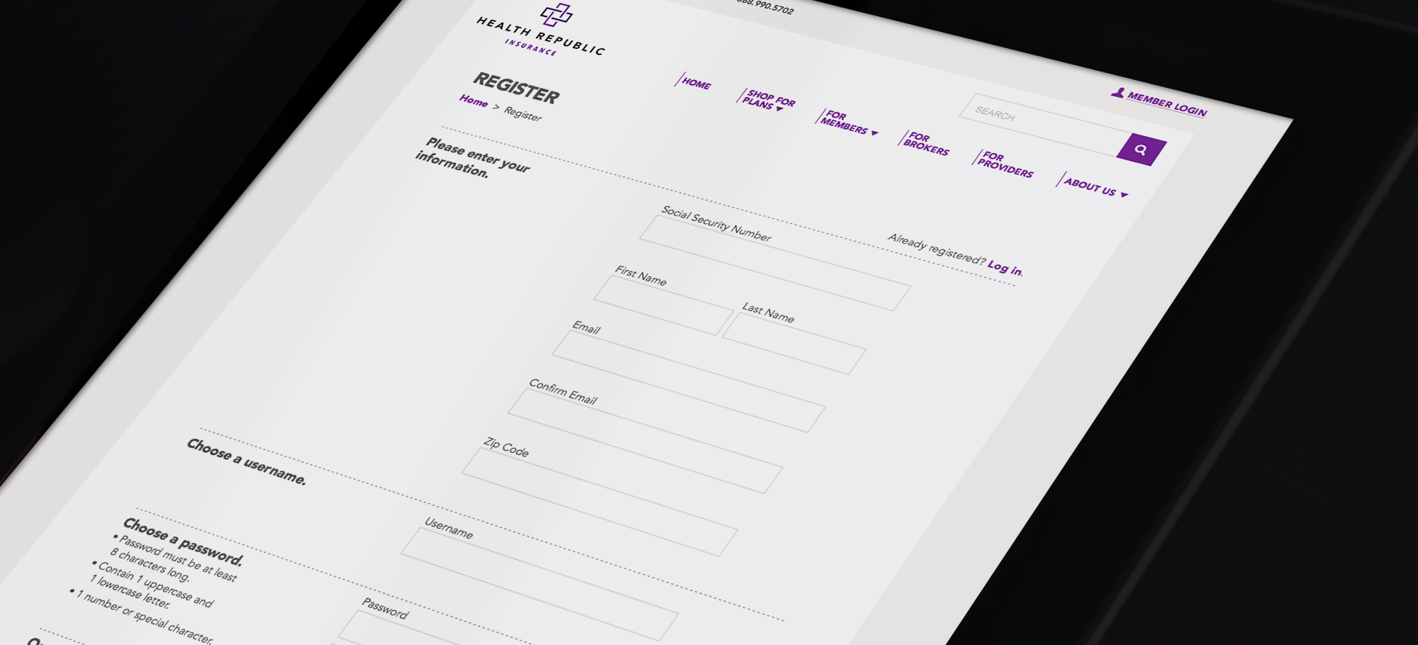
Health insurance website
Health republic, a health insurance company
CHALLENGE
This company and its member website was born from the intial Obamacare rollout. The site was a confusing experience, confounded by intial enrollment numbers being much larger than anticipated.
SOLUTION
I was brought in identify UX problem areas, make recommendations on fixing them, and then design the new screens. Key deliverables included:
• User Research
• Information Architecture
• User flows
• Form and screen design
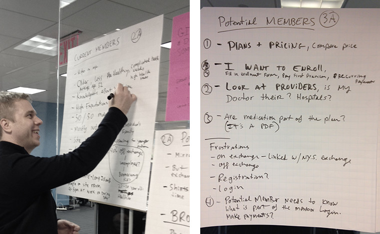
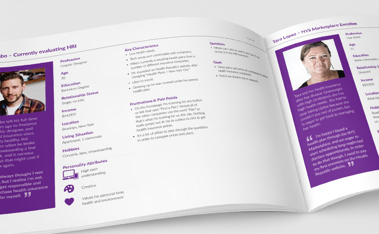
AUDIENCE ANALYSIS WORKSHOPS
I led a client workshop identifying all users, tasks and journeys... key first steps in overhauling the UX.

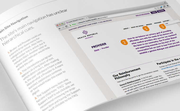
USABILITY (HEURISTIC) ANALYSIS
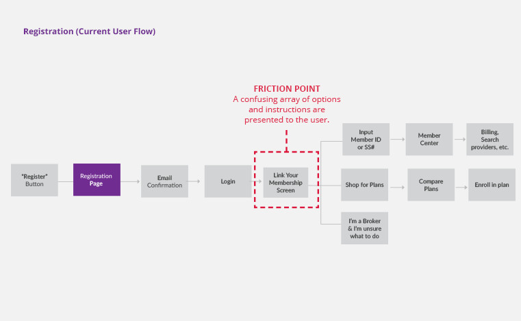
I analyzed their current site and identified usability issues across screens, forms and workflows. I then created a report documenting my findings and potential solutions.
INFORMATION ARCHITECTURE
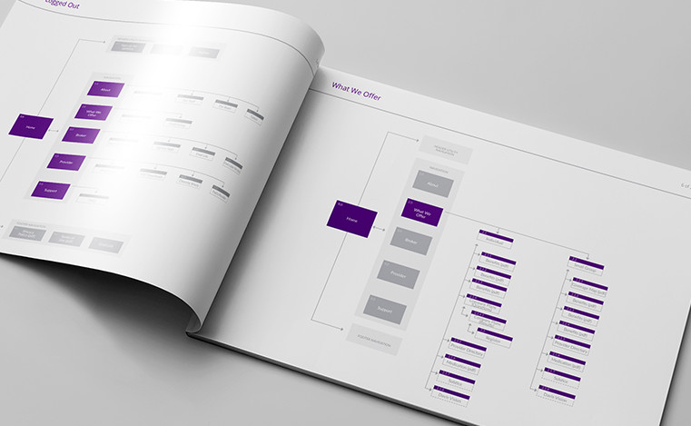
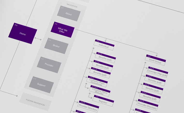
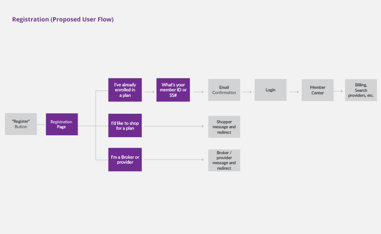
I reorganized the site architecture to surface important information. I also reworked critical user flows, including users arriving from the Federal/State Healthcare site, health plan searching and registration.
SCREEN DESIGNS
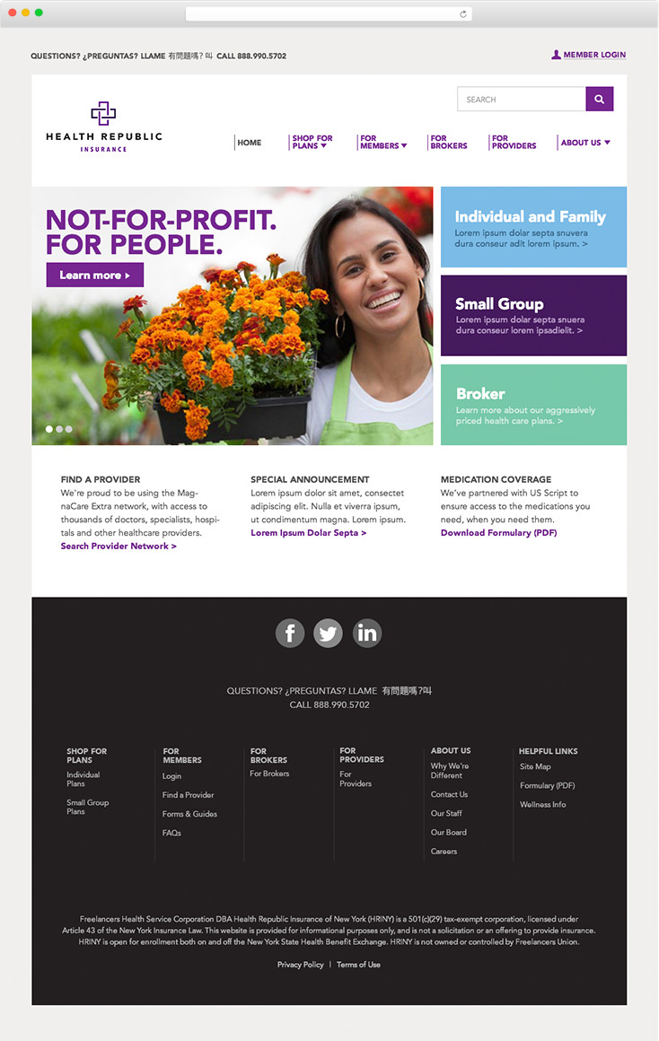
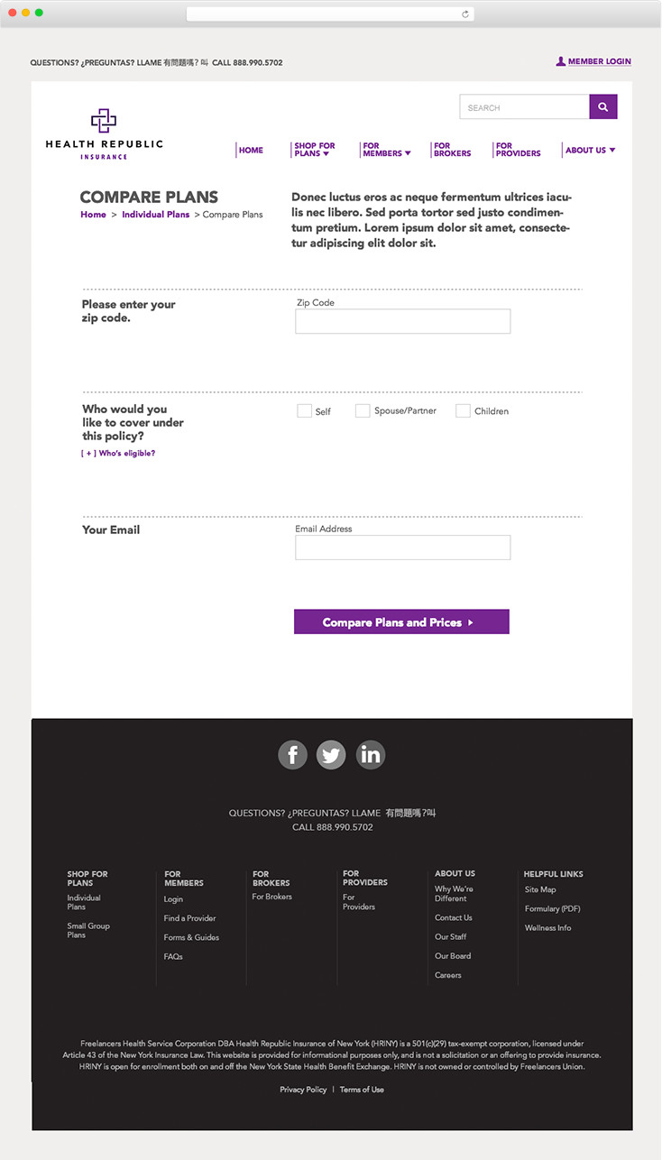
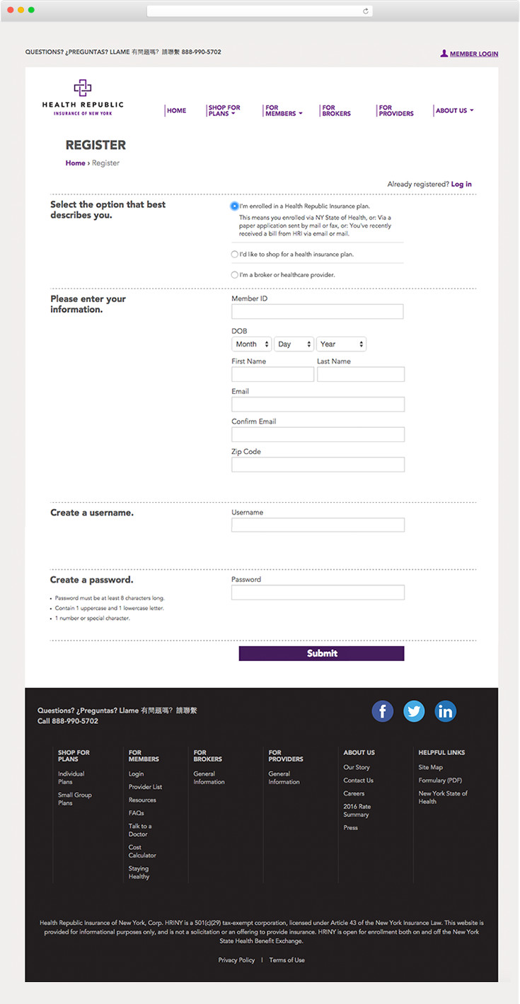
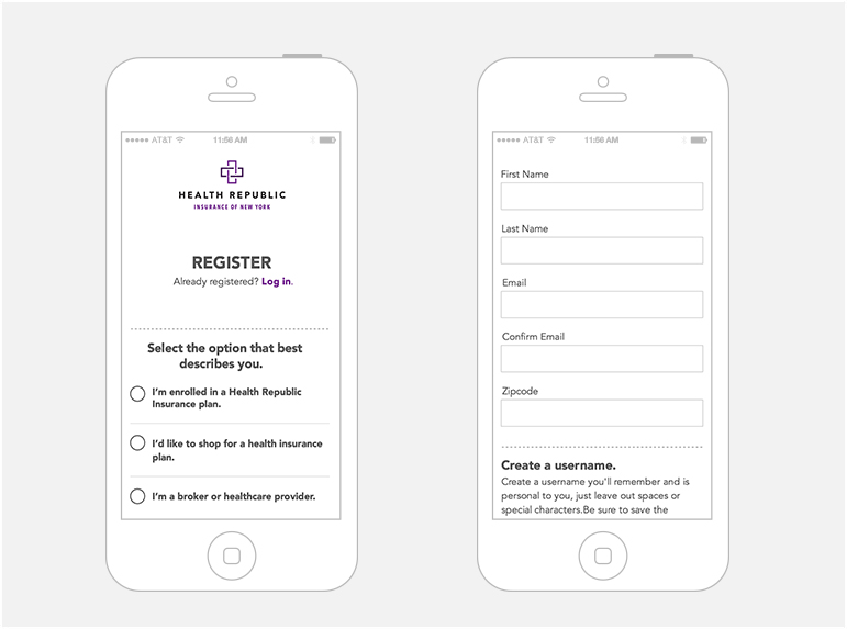
I designed 10 key screen templates that incorporated my usability fixes, includingnew registration forms, home screen, health plan comparison screens, member center screens and billing screens. These key templates were then passed off to the developers for implementatio.
Say hi!